How to Design Posters and Banners with Creative Display Fonts
Posters and banners are powerful tools for communication, whether for marketing, events, or social campaigns. A well-designed poster grabs attention, conveys a message instantly, and leaves a lasting impression. One of the most effective ways to achieve this is through creative display fonts. Unlike standard text fonts, display fonts are crafted for impact, style, and personality, making them ideal for headlines, posters, and banners. In this article, we’ll explore how to design posters and banners using creative display fonts to maximize visual appeal and engagement.
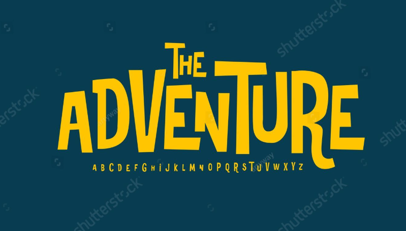
Understanding Creative Display Fonts
Creative display fonts are designed to stand out. They often feature unique shapes, high contrast, exaggerated serifs, decorative details, or artistic flourishes. Unlike body text fonts, which prioritize readability over long passages, display fonts are meant to capture attention and convey tone immediately.
Using the right display font can help define the mood of your poster or banner. For instance, bold geometric typefaces convey strength and modernity, while elegant script fonts evoke sophistication and creativity. When paired with complementary colors and layouts, display fonts transform ordinary text into visual statements that are hard to ignore.
See also: Seasonal Savings: When to Use Home Depot Coupons for the Biggest Discounts
Start with a Clear Visual Hierarchy
Effective poster and banner design begins with a clear visual hierarchy. The headline, usually the largest text on the layout, should feature your chosen creative display font. This ensures the main message is instantly visible, even from a distance.
Subheadings and supporting text can use simpler, complementary fonts to maintain readability while reinforcing the design’s personality. For example, pairing a bold display font with a clean sans serif for body text creates balance, drawing the eye first to the headline and then guiding it naturally to secondary information.
Consider Color and Contrast
Color plays a crucial role in making display fonts pop. High-contrast combinations, such as dark text on a light background or vibrant text over muted imagery, ensure legibility and visual impact.
Designers can also experiment with gradients, textures, and overlays to add depth to display fonts. For example, a metallic gradient on a bold headline can create a premium or dynamic look, while subtle shadowing enhances readability without overwhelming the design. Choosing colors that align with brand identity or the theme of the event reinforces the overall visual message.
Use Typography to Evoke Emotion
Creative display fonts are not just decorative, they communicate emotion. The choice of font style should match the tone of the poster or banner.
For example, playful, rounded display fonts suit children’s events or casual promotions, while sharp, angular fonts work well for tech, sports, or action-themed designs. Script and handwritten display fonts add a personal, artistic touch, perfect for cultural events or artisanal product promotions. Matching font style to the emotion you want to convey strengthens engagement and makes your design more memorable.
Balance Creativity with Readability
While display fonts are meant to stand out, readability should never be compromised. Avoid overly intricate fonts for lengthy text, and test your layout at various sizes to ensure legibility.
Use kerning, line spacing, and alignment adjustments to create clear, visually pleasing text blocks. Designers should also consider the viewing distance; a poster on a wall may require larger, bolder letters than a banner meant for online promotion. Proper balance ensures your message reaches the audience effectively while maintaining aesthetic appeal.
Experiment with Layout and Composition
Creative display fonts thrive in innovative layouts. Designers can play with asymmetry, layering, and text rotation to add interest and movement. Large-scale text can act as a background element, while smaller display text emphasizes key points.
In banners, horizontal or vertical alignment, spacing, and integration with imagery determine how effectively the text interacts with the visual content. Experimenting with composition while keeping hierarchy and readability in mind ensures a cohesive and eye-catching result.
Conclusion
Designing posters and banners with creative display fonts is a combination of art and strategy. Display fonts bring personality, energy, and visual focus to your designs, making them memorable and effective. By establishing a clear hierarchy, choosing complementary colors, matching font style to emotion, and balancing creativity with readability, designers can create compelling visuals that capture attention instantly. When used thoughtfully, creative display fonts turn simple posters and banners into powerful marketing tools, leaving a lasting impression on audiences long after they’ve seen the design.